If you’ve been looking for a way to track the coronavirus outbreak, you may have noticed that most solutions are either overly simplistic in terms of the information they provide or not very well designed. Both of these factors don’t inspire a lot of confidence in their accuracy.
The one that rises above the crop is The Coronavirus App. This web app has a very informative and interactive UI that Plague Inc. players will feel right at home with.
The map shows each country’s name in its local language, which is nice but potentially confusing for those who don’t speak all the world’s languages.
Hovering over the region though or clicking on its bubble will show the name in your selected language, along with additional stats.
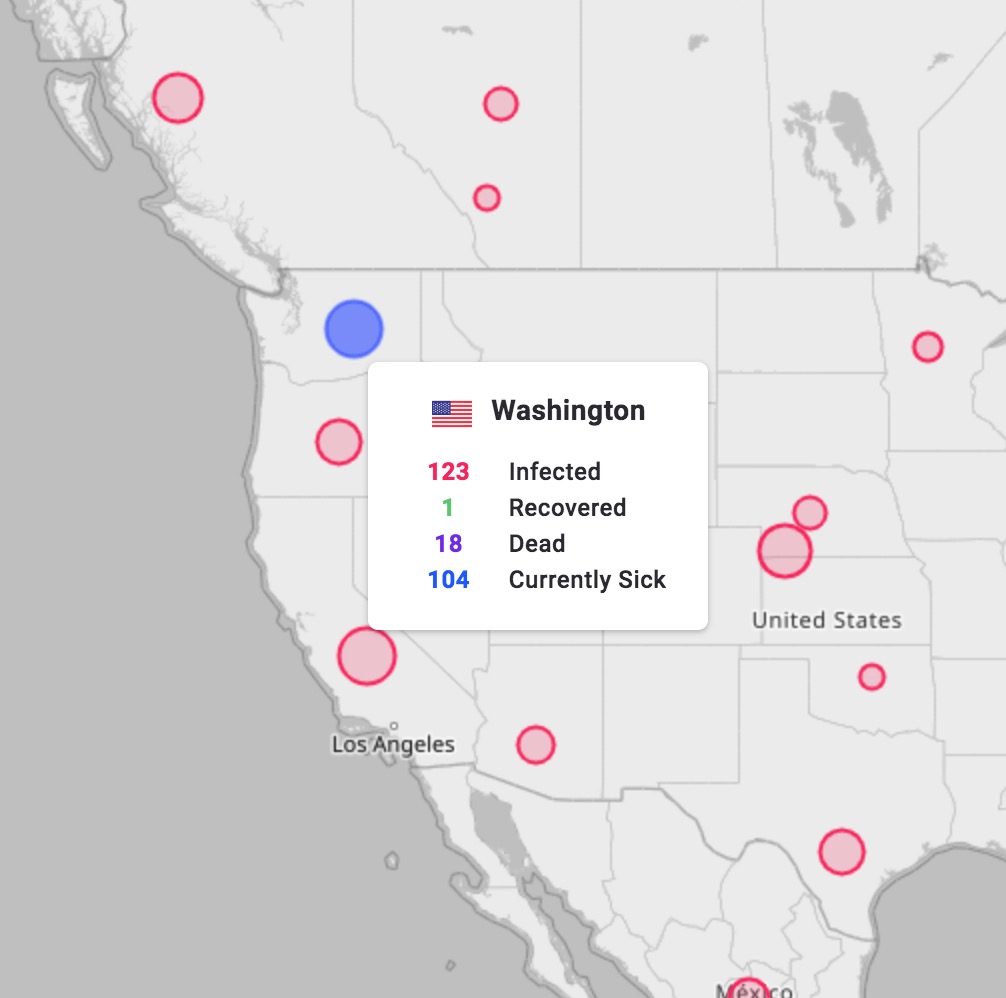
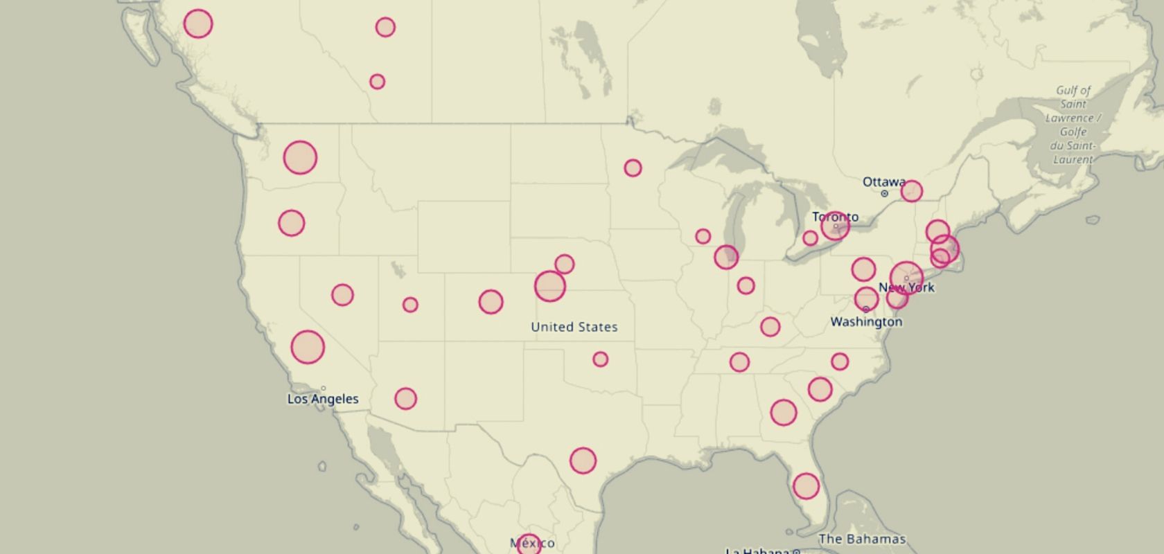
By default, the map is littered with red bubbles the size of which corresponds with the number of infections in that country. In larger countries like the US, Canada, Australia, and China, you can zoom in to see the individual infection count of each state or province.
Clicking on the bubble shows the information in the form of graphs, including a line graph tracking each figure over time.
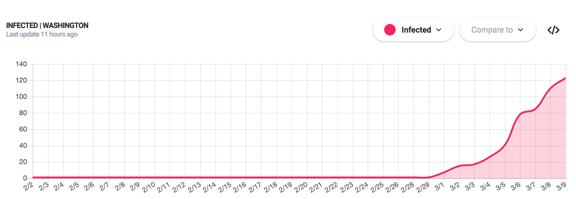
The graphs can also be used to visualize the difference between one figure and another, for example, the infected versus the cured. All of these graphs can be embedded in other websites.
The hamburger menu also includes a “Graphs” view, which shows international figures with the same functions as country graphs.
On desktops, there is also a sidebar that shows a total count of infected, dead, recovered and currently sick. Below those figures is a breakdown by country.
Clicking on different figures in the sidebar will change the bubbles in the map view as well. By default, the red “infected” bubbles are selected. Deaths are represented by purple bubbles. Recovered are green and currently sick are blue.
The hamburger menu allows access to additional features, including an API and the option to embed the entire map into your website.
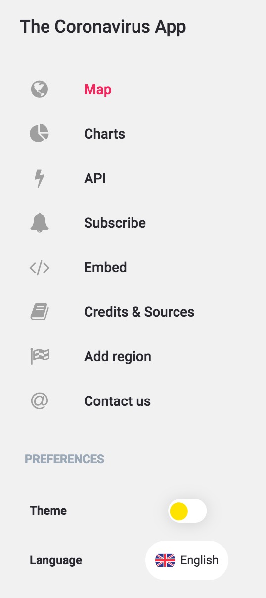
This app is very complete and thorough, including a dark mode, a PWA, push notifications and email summaries.
If you're tired of censorship and dystopian threats against civil liberties, subscribe to Reclaim The Net.