It’s not uncommon for app and website redesigns to have users up in arms over the changes. There’s something to be said about not fixing things that aren’t broken – and people are, after all, creatures of habit.
But some redesign decisions go down harder than others, and that seems to be the case with the newest incarnation of Twitter’s user interface (UI) for its desktop app.
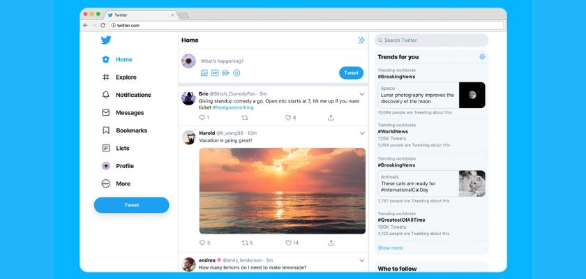
What Twitter has done is causing quite an uproar among many of its users, who are now desperate to find ways to switch back to the old design. It offered much greater content density compared the sparseness of the new UI which has even users with large desktop displays reporting seeing only two tweets at a time.
Twitter recently made the decision to give Twitter’s website a “facelift” for the first time in seven years.
“Platform for public conversation”
Early adopters who switched to an early version of the new UI in January weren’t charitable about it. From finding it ugly – a subjective, but wholly understandable label to slap on this design – to pointing out that Twitter’s real problems were elsewhere, and so should be its priorities – they were not happy.
Fast forward to July – and the new, three-column design with seemingly randomly rearranged elements has been imposed on all users. A Twitter product design director called it “a simplification.” The product now offers bookmarks, but still no edit button. And this desktop design looks like it belongs on a mobile device.
A Wired featured managed to make a connection between the UI change and Twitter preparing to combat so-called “hate speech” more than before – but it also revealed that the thinking behind it was to “redefine” the purpose of Twitter as a platform for public conversation. And to drive “likeminded” users toward each other – in other words, to create an even stronger echo-chamber.
We also learned from the report that in some countries, like Japan, which is described as one of Twitter’s biggest markets, users like to create multiple accounts for various interests – and the new design is facilitating switching between them with a new profile button.
There’s been user feedback in the process of testing the new design, too. Twitter said it received about 200,000 messages from all over the world and promised that they were actually being read.
But the company was tight-lipped about what the feedback was about, revealing only that “the number one” feature requested was putting “an emoji keyboard in the composition box.” And that, Twitter has done.
But the thing most users who are critical of the redesign take issue with are not the new features per se – like bookmarks, the dark mode, or indeed, the ease of using emojis. Instead, the dissatisfaction mostly has to do with the new layout of the elements itself.
How to work around these changes
On Twitter, users are sharing workarounds and hacks in an attempt to revert to the previous design.
Click here to display content from Twitter.
Learn more in Twitter’s privacy policy.
Some of these solutions involve using a browser’s developer tools – that territory into which a majority of users likely never sets foot. Then there are other suggestions that make use of what are likely loopholes in Twitter itself that will sooner or later be closed.
Click here to display content from Twitter.
Learn more in Twitter’s privacy policy.
Meanwhile, a host of video tutorials has been springing up on YouTube – some with more chance for success than others – explaining to Twitter users how to get their old layout back. In some cases, updates to these videos show that Twitter is working hard to make the workaround solutions impossible.
Other suggestions found on the web include switching your browser’s user-agent to Internet Explorer 11, which the new Twitter UI does not support. This is done by installing user-agent switching extensions in Firefox or Chrome.
Finally, third-party apps can also be that solution – and if you’re using Mac OS you might be in luck. One such product, Twitterrific, provides a desktop client for Mac OS that aims to ensure a higher degree of visual integration with the operating system’s existing UI designs.
And this app also provides some metrics to gauge the level of dissatisfaction among Twitter users: according to Twitterrific statements to Reclaim The Net, there have been “two to three times” more new sing-ups since Twitter rolled out its new design.
It’s not surprising.
If you're tired of censorship and dystopian threats against civil liberties, subscribe to Reclaim The Net.