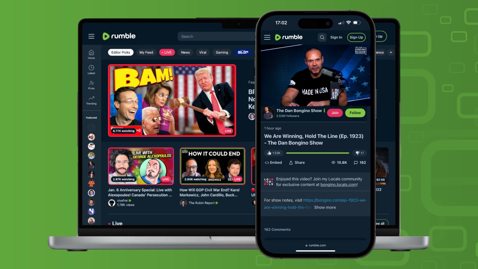
Video sharing platform Rumble has rolled out a new desktop and mobile web design that provides more video stats and makes it easier to navigate to specific categories.
The new design features category bubbles at the top of the homepage which make it easier to quickly jump to specific homepage categories with a single click or tap. Previously, users would have to manually scroll through the homepage categories.
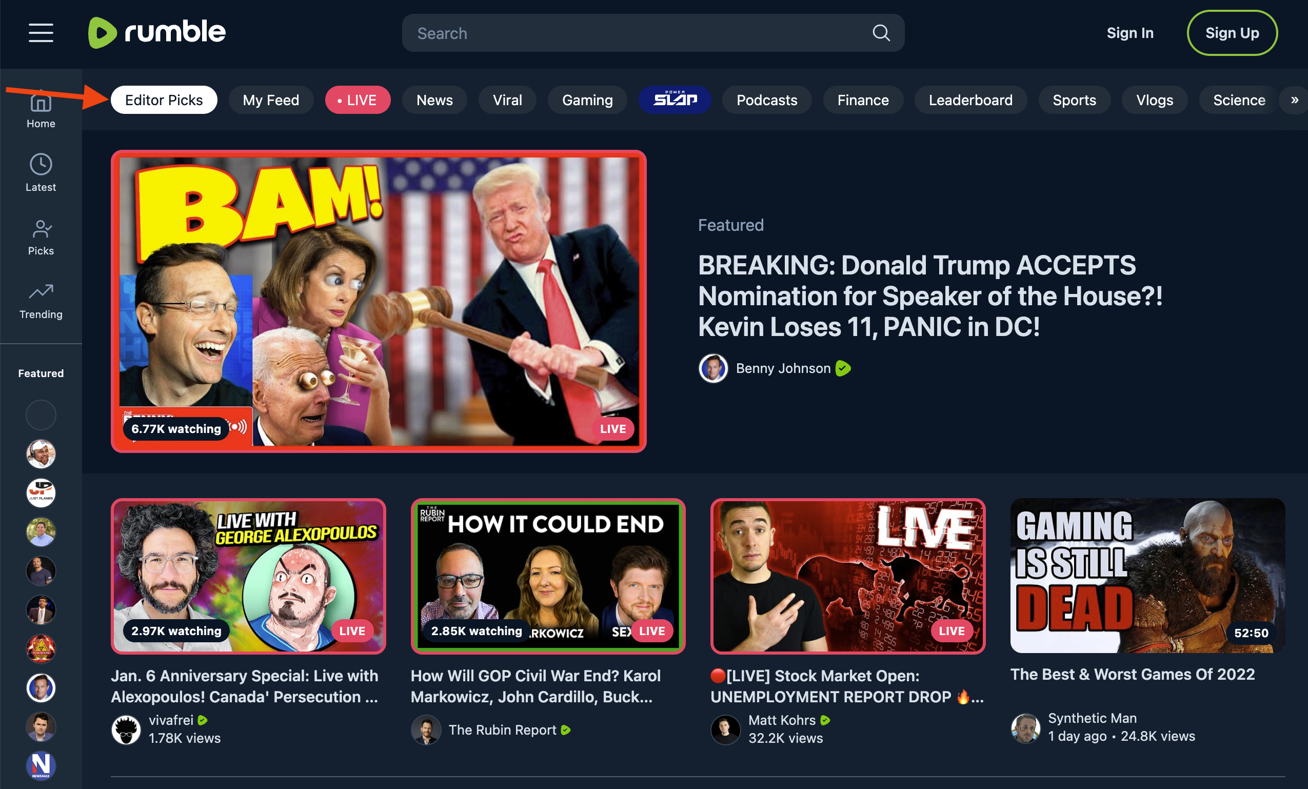
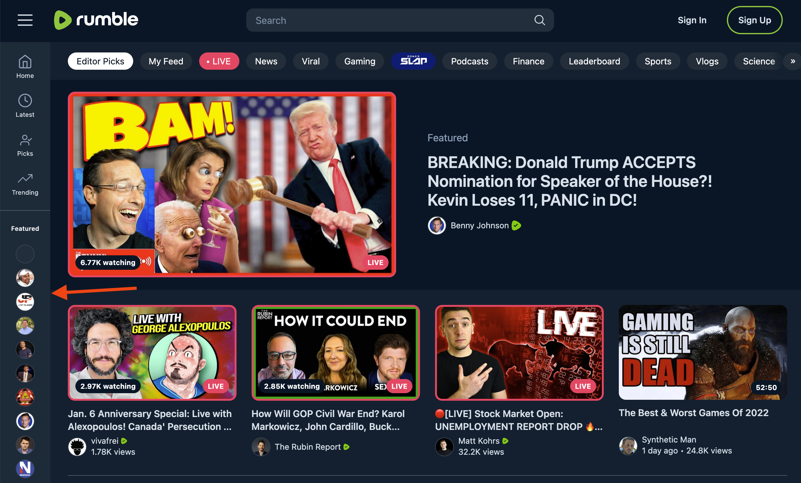
The left sidebar on the desktop homepage has also been revamped with this new design. Previously, this sidebar would be hidden until users clicked or tapped on the top left menu icon and it didn’t show the profile images of the featured channels or their subscriptions. Now a minimized version of this sidebar is always visible on the desktop homepage and users can click or tap to expand it.
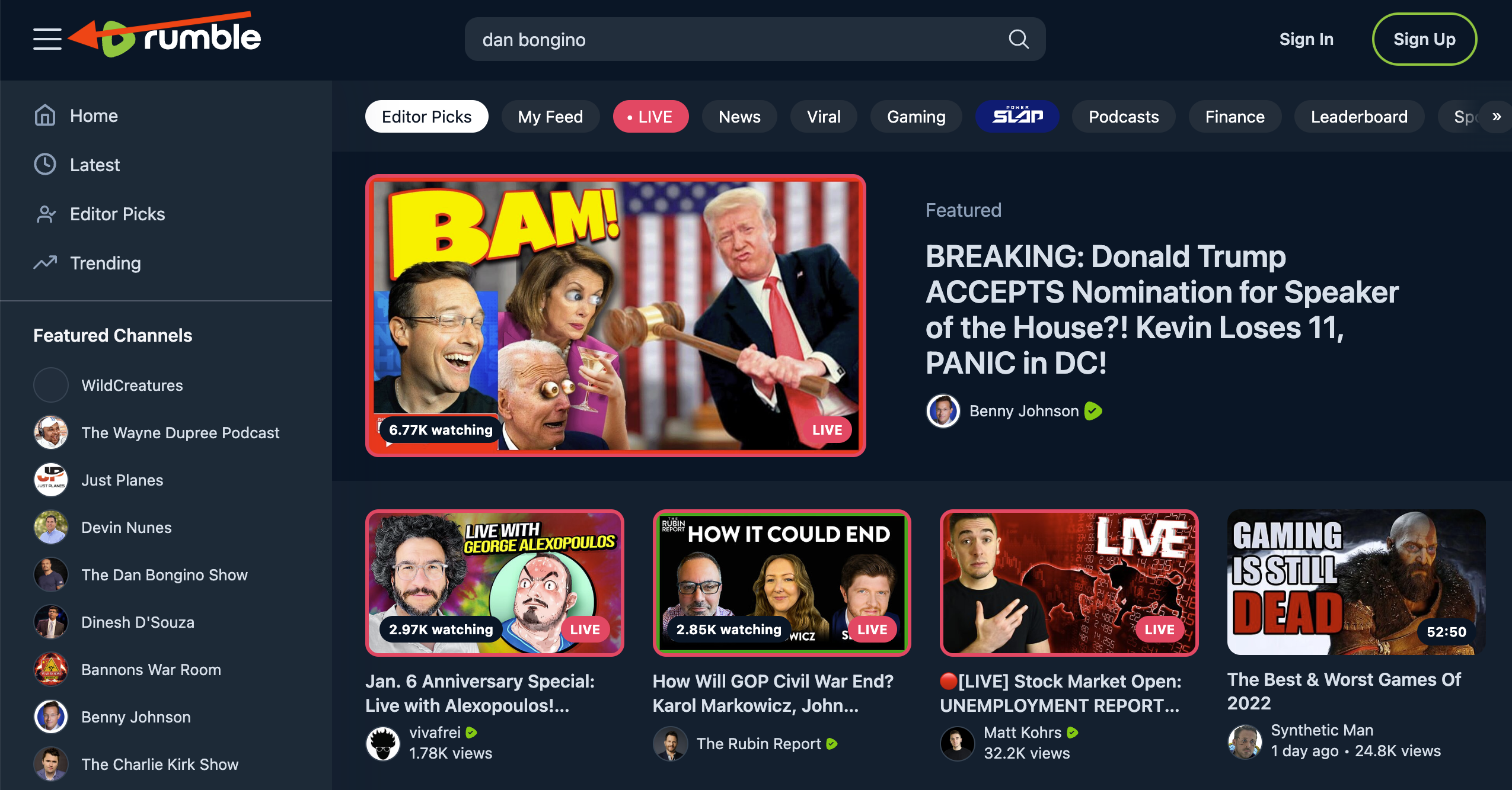
Another change with this new design is that the main video that’s highlighted on the Rumble homepage is now more prominent.
Video thumbnails across the site have also received an upgrade and are now larger and high definition.
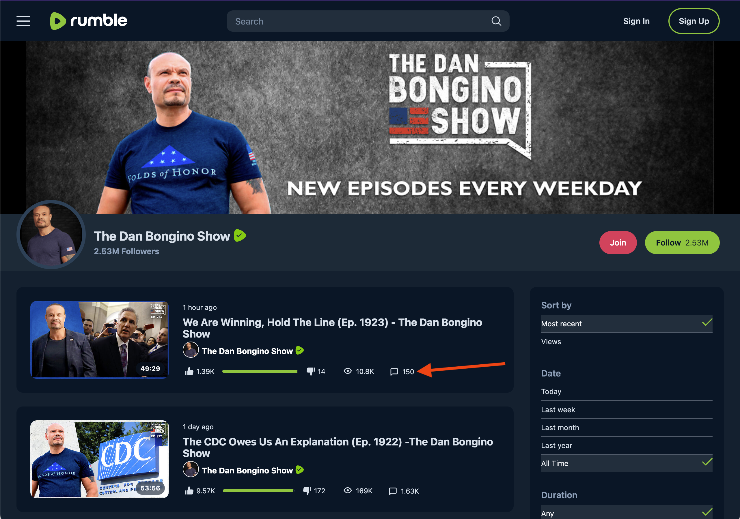
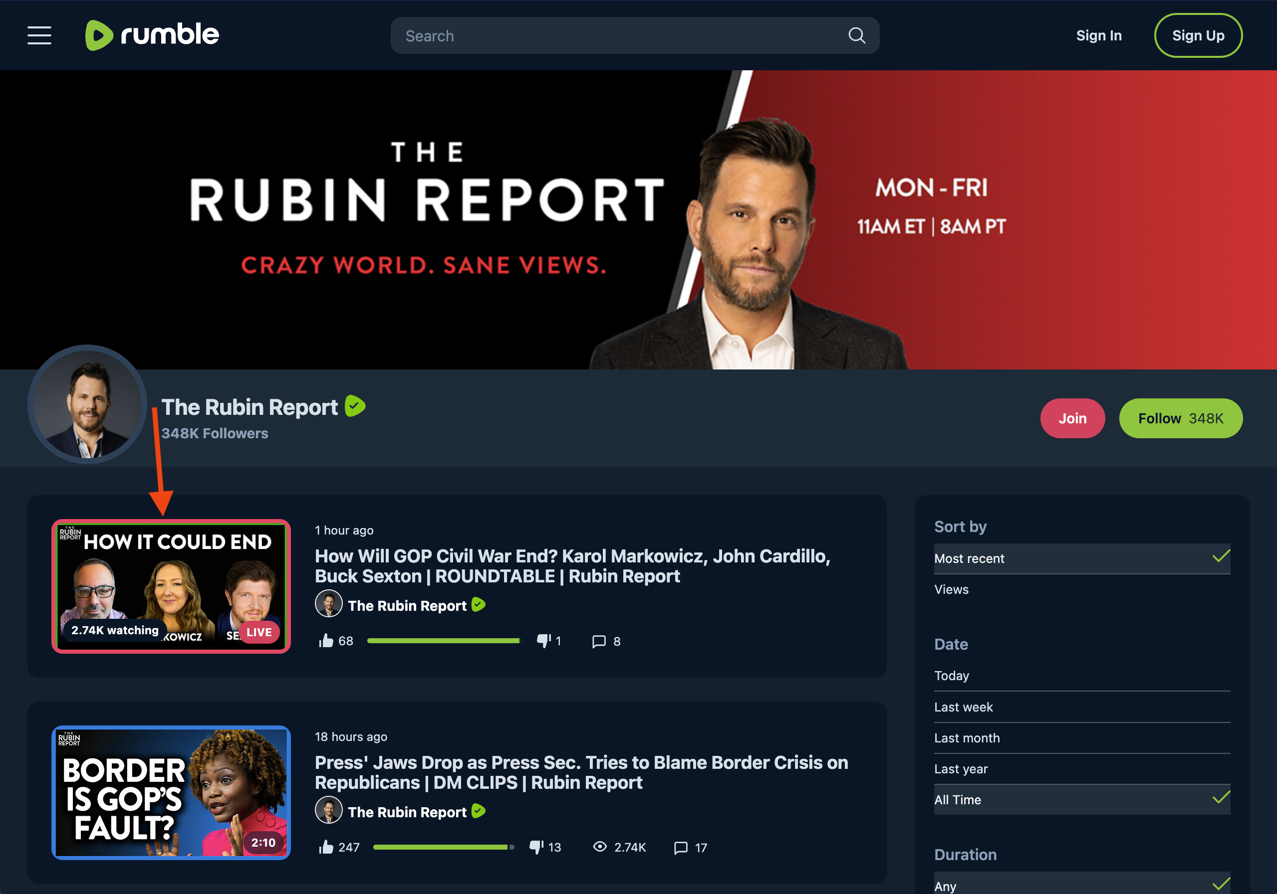
Additionally, the new design displays more details about each video that’s highlighted on channel pages, category pages, and in search results by adding a like-dislike count and ratio bar and a comments count. The old design would just display the views, total Rumbles (total likes-total dislikes), and upload date.
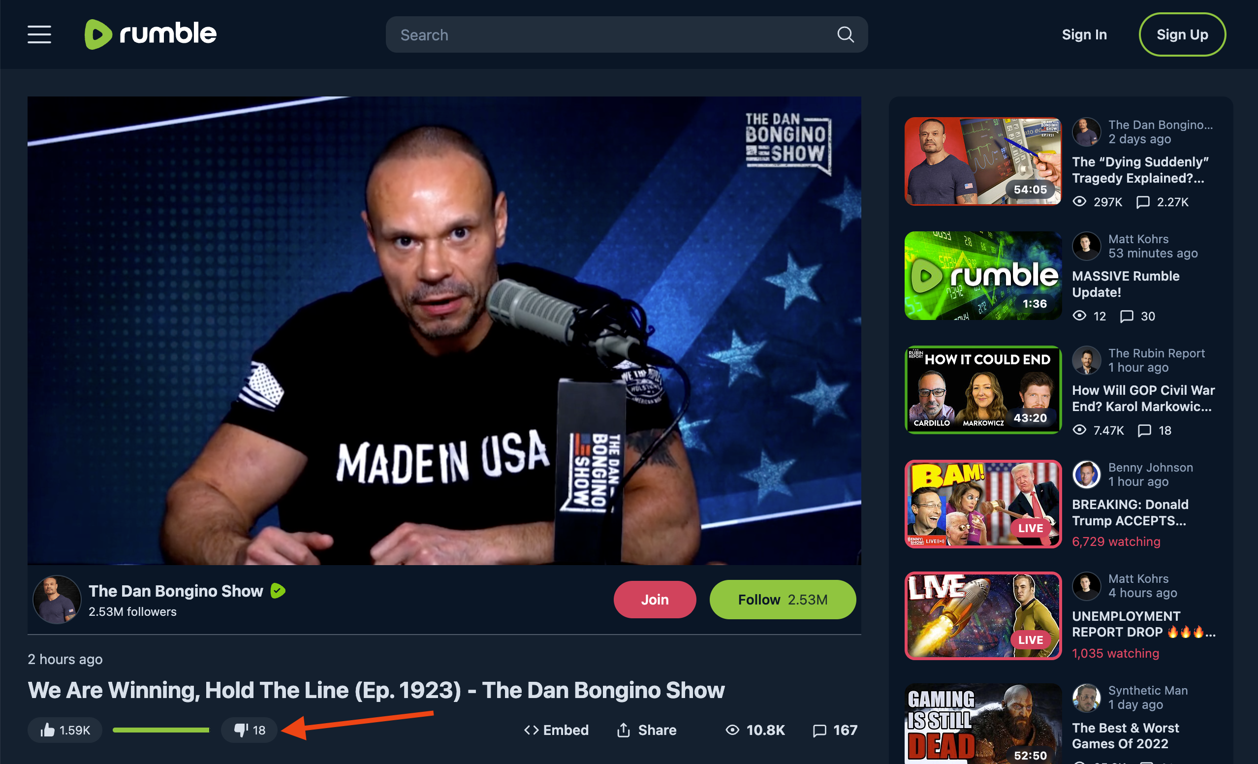
Rumble’s video pages have also had a revamp with this new design. The previous design would display the total Rumbles but the new design shows the like-dislike ratio bar, the total number of likes, and the total number of dislikes.
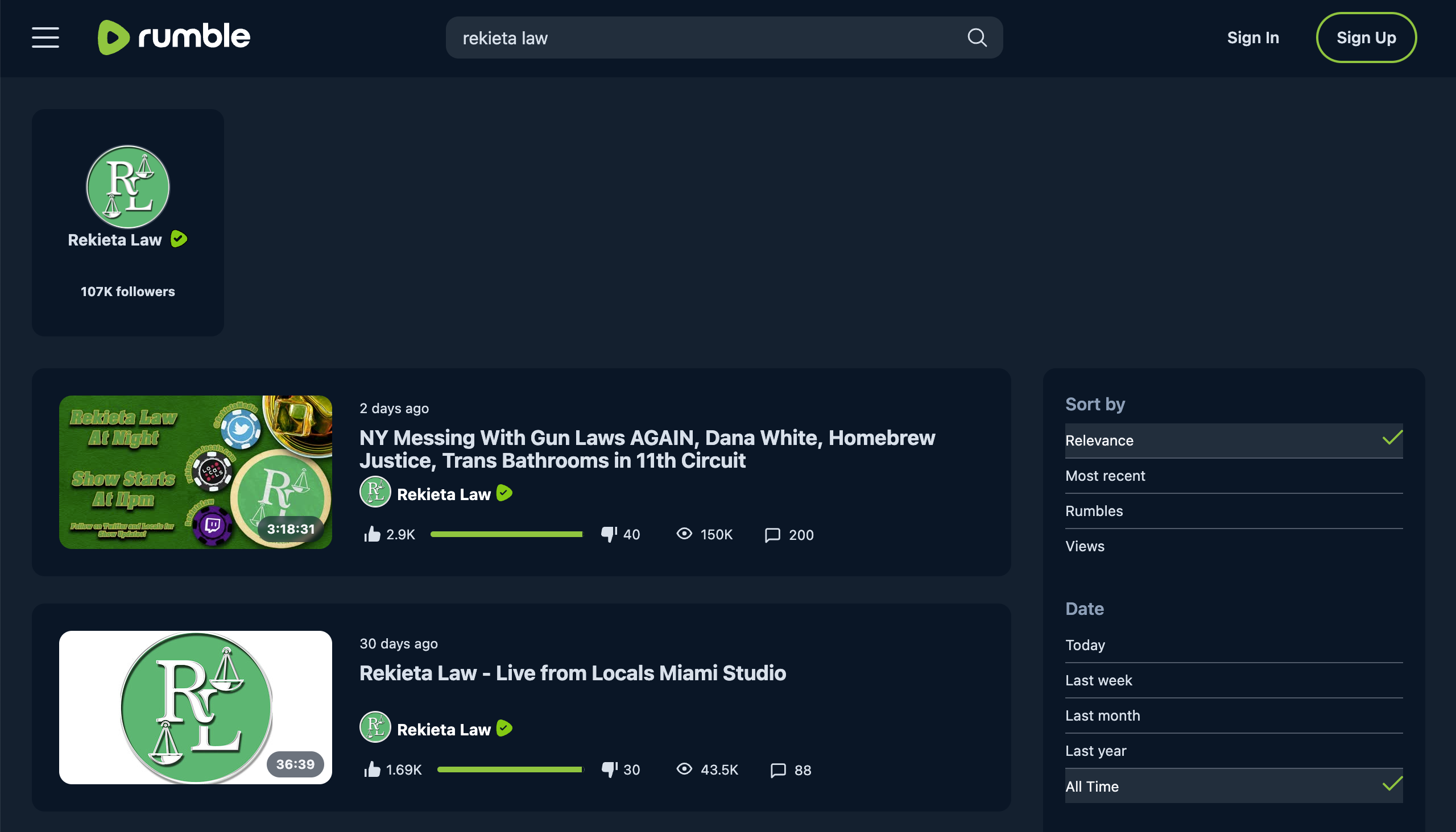
Search result pages have also got a new look and now include both channels and videos.
Additionally, the new design adds a red border to live videos on the homepage, channel pages, category pages, and search result pages.
“Having a good UI/UX is imperative to compete in this market, and I’m happy to announce that we have taken a big step forward,” Rumble Chairman and CEO Chris Pavlovski said. “We will not stop here. Improving our video-sharing platform will continue to be one of our top priorities in 2023.”
The new desktop and mobile web design is the latest of many changes Rumble has made over the last few months. Some of the other changes include the addition of in-app notifications on mobile and the introduction of pre-roll ads.
If you're tired of censorship and dystopian threats against civil liberties, subscribe to Reclaim The Net.

